Refining Our Look
One of the earliest decisions that I made when starting to work on the game was to use the "faceted" art style for all the game's assets. The primary driving force behind this decision was that it allowed us to quickly create assets without spending a ton of time making them look realistic. This was a boon to us early on in the development cycle and is one of the reasons that the work on the game proceeded so quickly. An MMO requires thousands of different assets, from weapons and gear to environments and monsters, and I knew that there was no way we were going to be able to create a "realistic" looking game with the resources that we had to work with at the time. In addition, it allowed us to hit target goals in terms of rendering and performance when we were largely unsure of how that would all shake out as we built out a massive world.
However, one of the downsides to the specific art style that I chose was that it turned off a number of people who normally would have enjoyed playing the game. In addition, the style didn't really consistently work across all different types of assets in the game the way that I hoped. For example, buildings looked pretty good, but monsters and players looked too blocky to the point that it was a little distracting when you were playing the game.
I'm pleased to announce that thanks to the mighty efforts of Elijah and Brian, we have embarked on a project to refine our art style into a consistent look that we think will really make the game more attractive. Here are a couple of screenshots from the new-and-improved Highsteppe area to give you an idea of the new style:
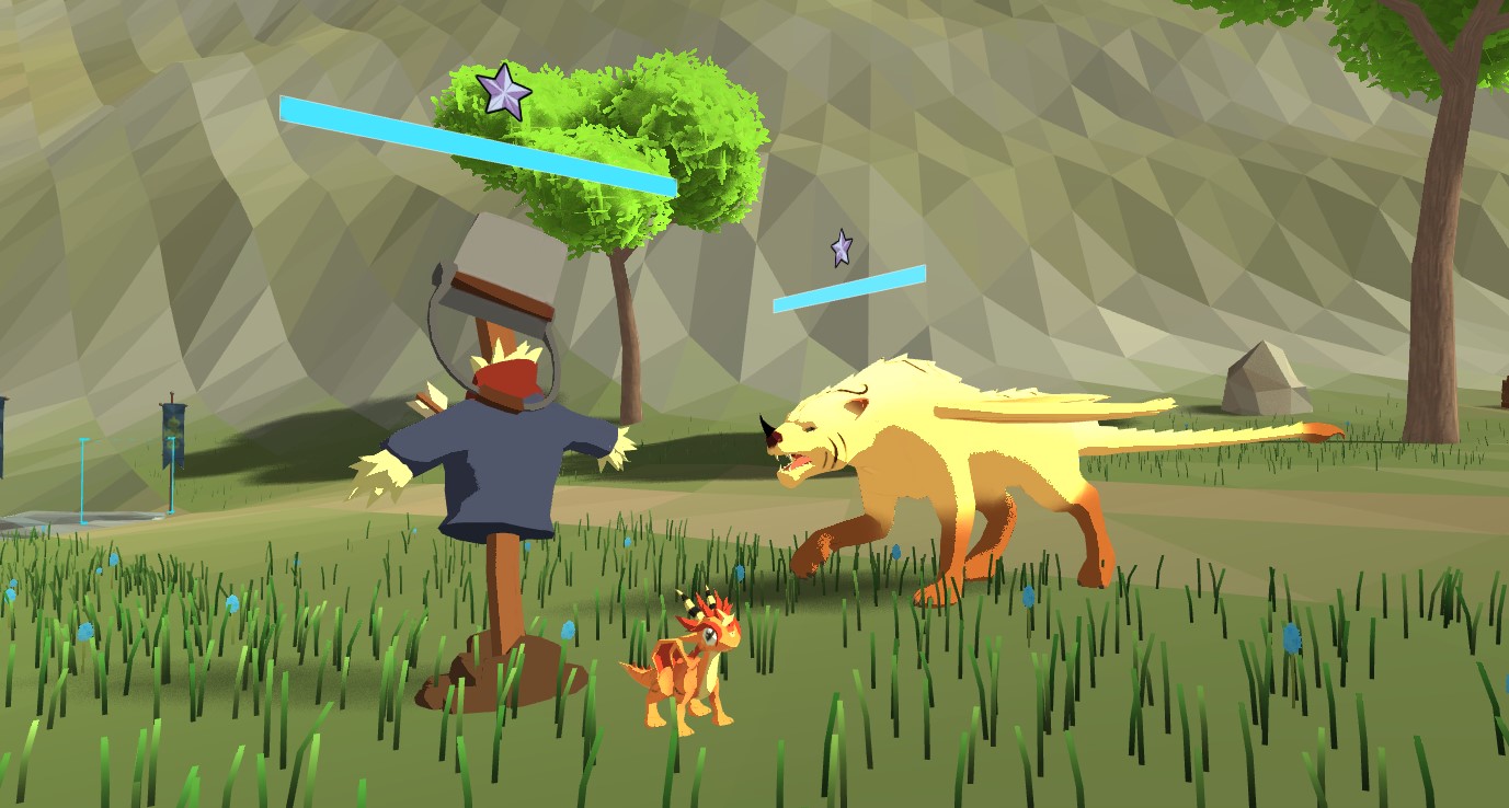
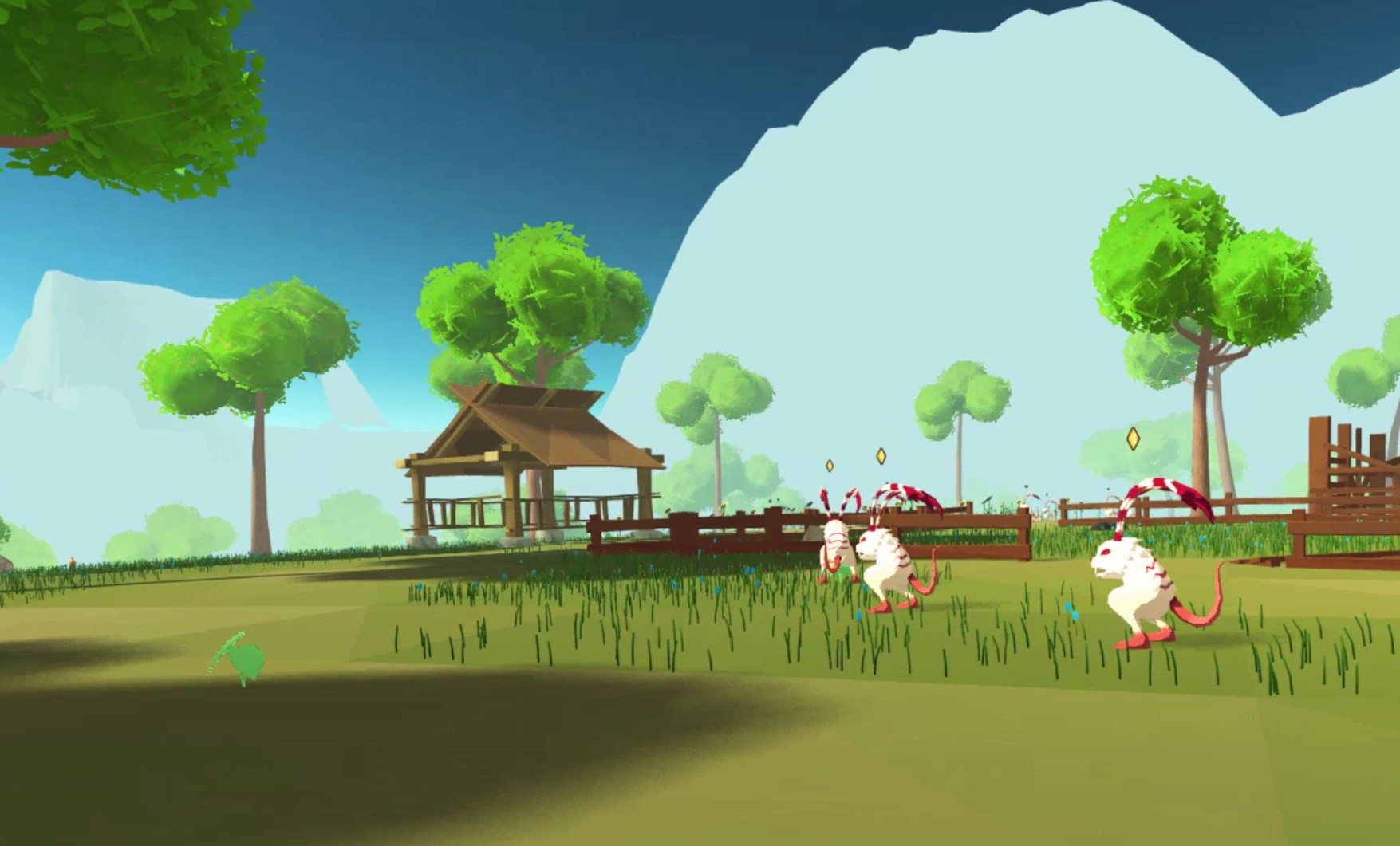
Interactive elements of the world (such as the monsters, players, and gear) are now using a more cel-shaded lighting style along with vibrant, strong colors. Elijah and Brian have been hard at work re-doing all of these assets so that not only are they more colorful, they now all have a consistent art direction. You'll also notice that we've upped our game on our environmental assets, and trees are no longer just boxy approximations, but are now vivid and bright with leaves that sway in the wind.
Static elements in the scene such as buildings and terrain will have a more flat-shaded look with realistic lighting and shadows. You'll begin to see us introducing some textures as well (rather than just faceted coloring) to these elements as we continue to improve and refine this style. This juxtaposition between colorful, cel-shaded elements against a background of static elements was used to great effect most recently in the Breath of the Wild game by Nintendo, and it's a major inspiration for our new art direction.
Beyond just a change to the shaders and coloring of a few assets, we've gone back and re-worked our entire post-processing stack, lighting effects, and more to all better match this new art direction. When you enter Orbus, we want you to be transported to a magical, amazing place that feels like another world, and we think this really gets us even closer to accomplishing that goal.
When you log into the Beta on Wednesday, you will find that all player gear, NPCs, and the vast majority of creatures in the game world have been updated with the new art style, as well as environmental assets in most zones. We'll continue to work on changing over the rest of the assets in the game as the final Beta period progresses.
This was a major project that we actually began planning months ago. We held off on publicly revealing anything because we didn't know if it was going to be possible to execute it in time for launch. Special thanks to all the team members who pitched in extra hours to accomplish this goal!
I'm really excited for you all to get to join us and check out these improvements the next time you're in-game. See you soon!
If you wish to discuss this post you can do so on our forums.